
Avanade Studio
Avanade Studio
Branding a digital innovation studio
Branding a digital innovation studio
Project overview
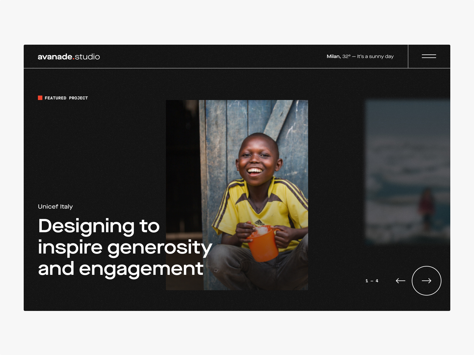
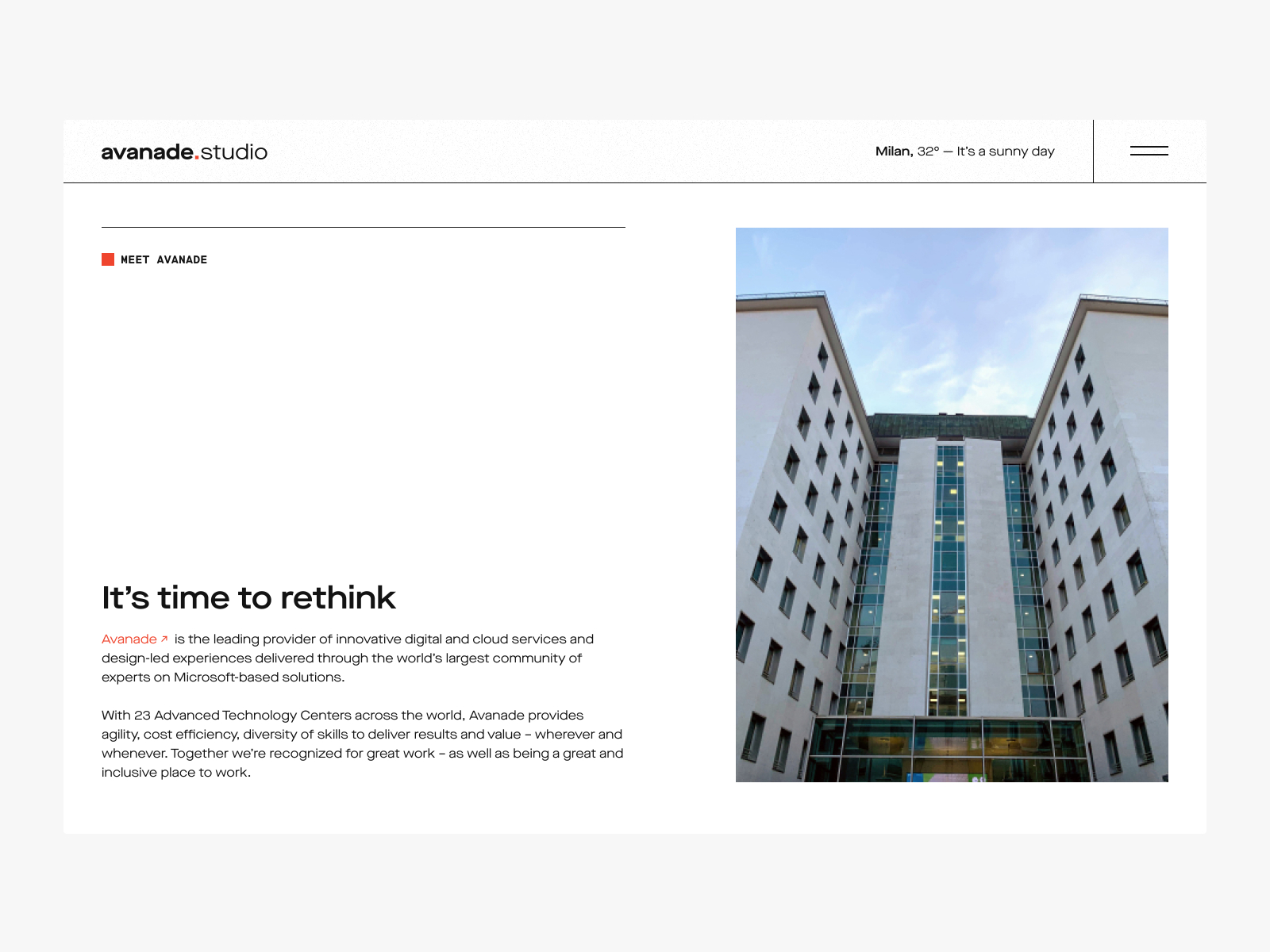
At Avanade we had the chance to work on a four weeks project to design a new concept about the brand identity and the website of the Milan Digital Innovation Studio.
We started by analyzing the competitors, the market and the context to define the best strategy and the direction to follow. Guided by our design principles we comed up with a strong proposal to mantain a link with the Avanade environment but with a new brand positioning.
—
Designed at Avanade with:
Danilo Rolle, Creative Director
Francesca Maio, Visual Designer
Angelo Oldani, UX Designer
Year:
2021
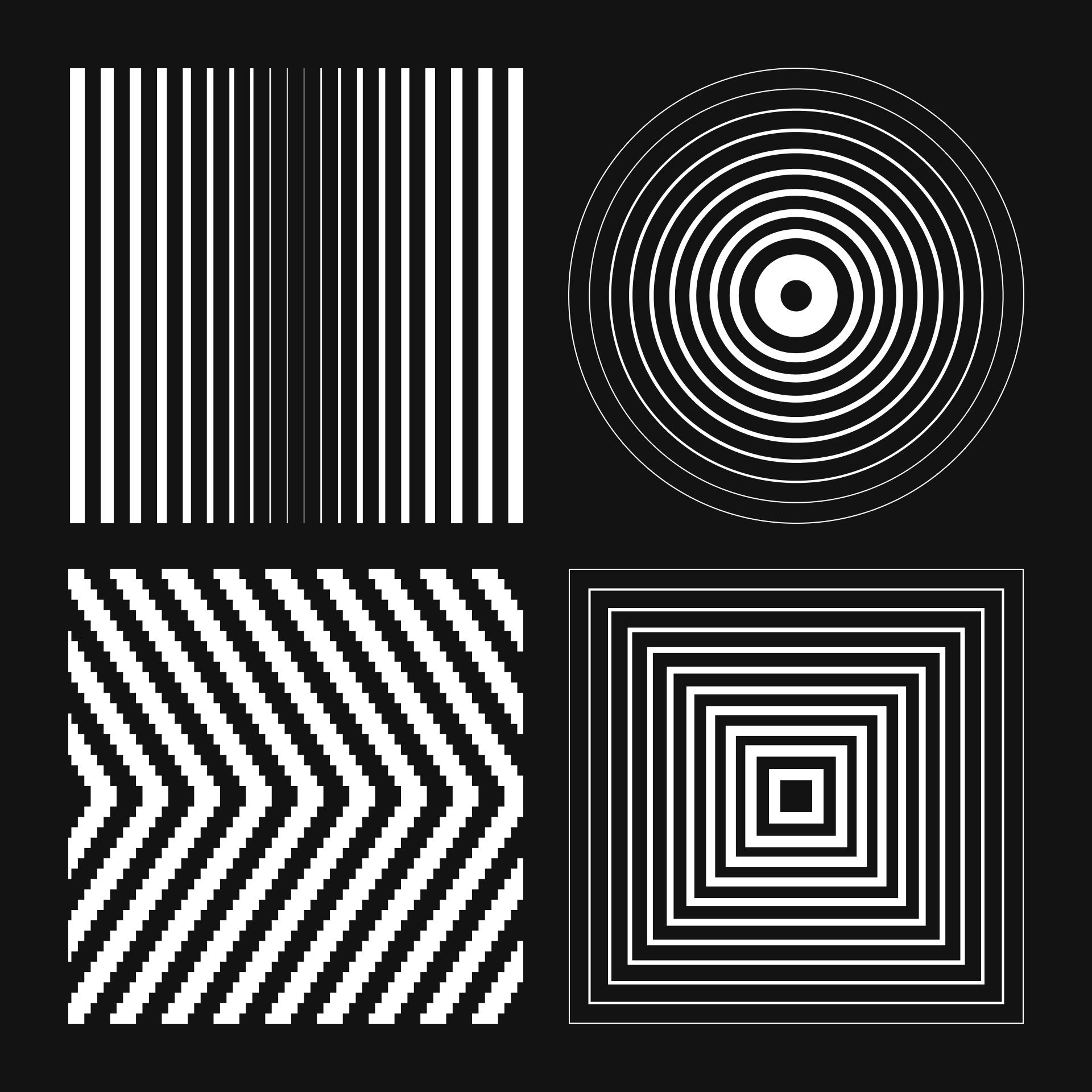
Design principles
Design principles
• Repetition
The repetition of shapes works in concert with each other design elements to strengthen our style and create strong visual patterns
• Contrast
We use contrast to create highlights and convey our messages focusing on the essentials
• Immersion
We believe in immersive experience to connecting people emotionally
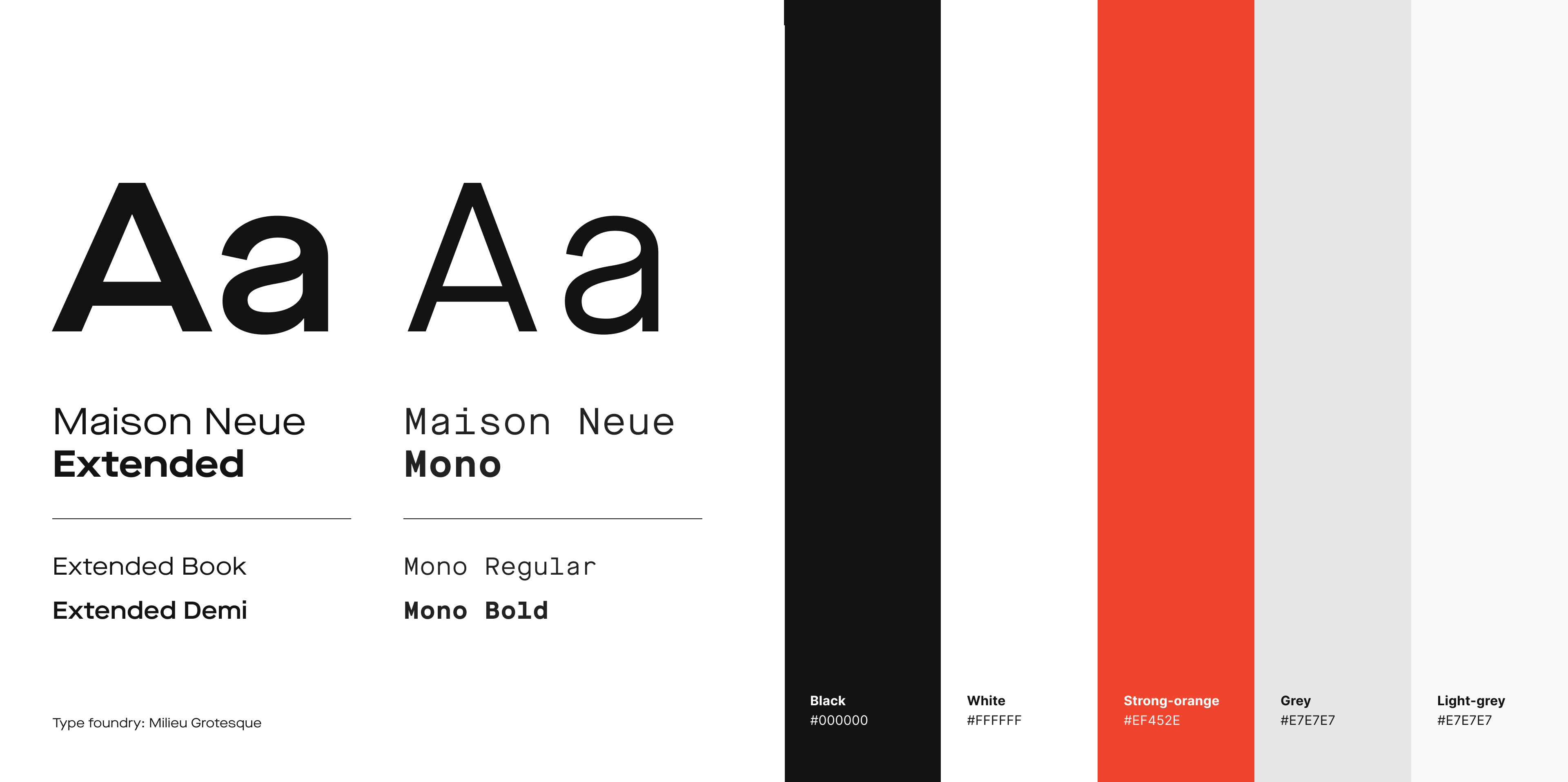

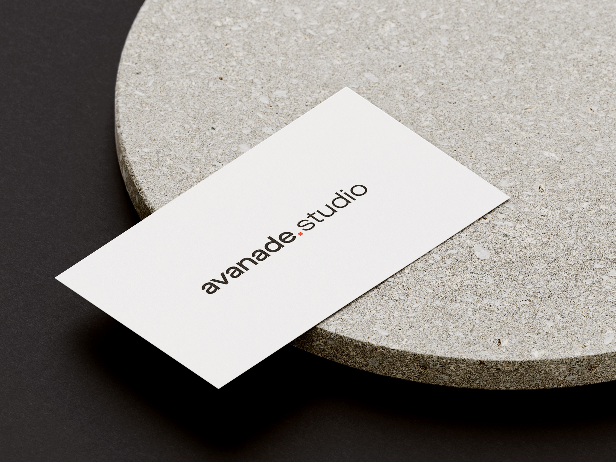
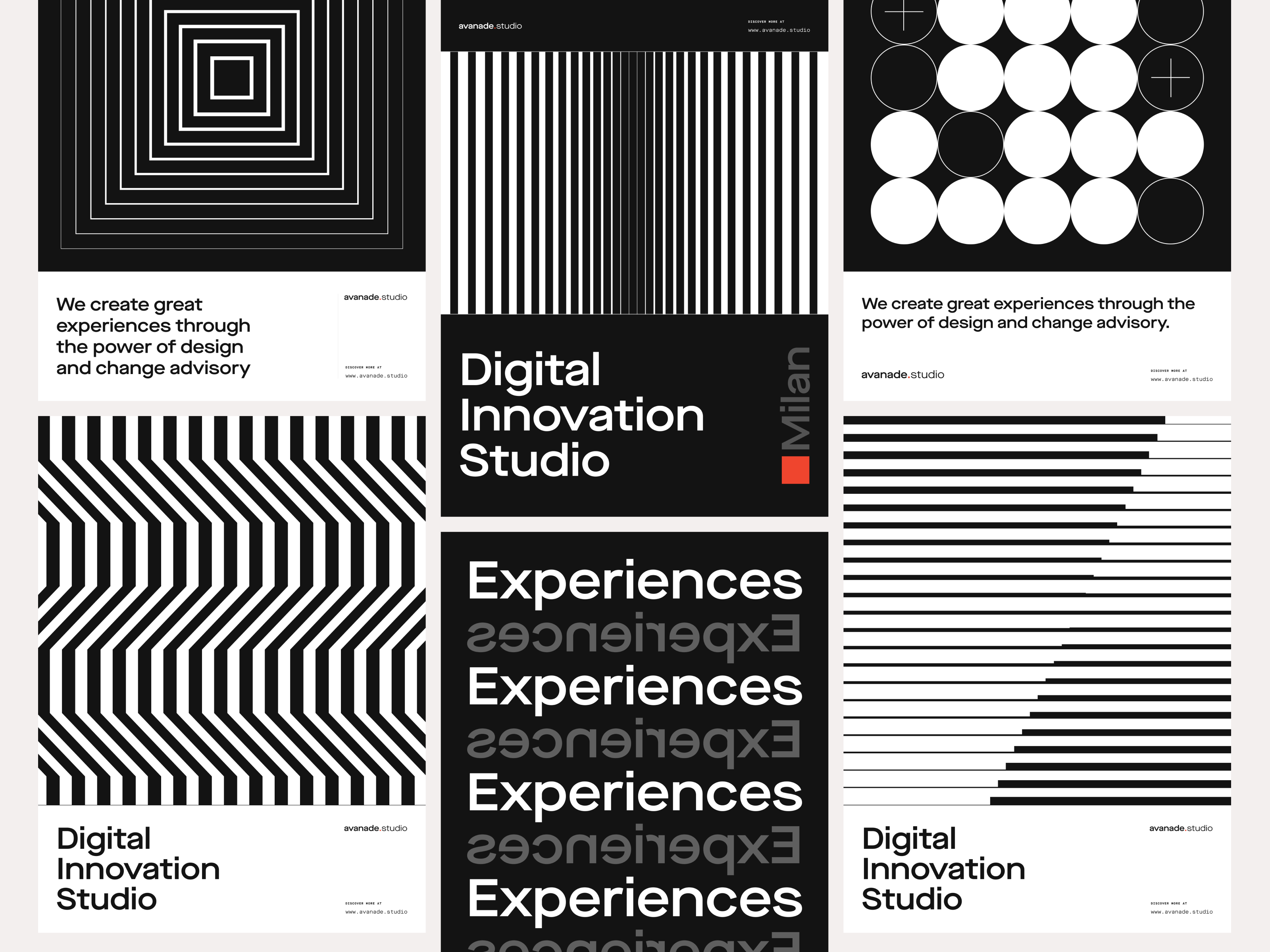
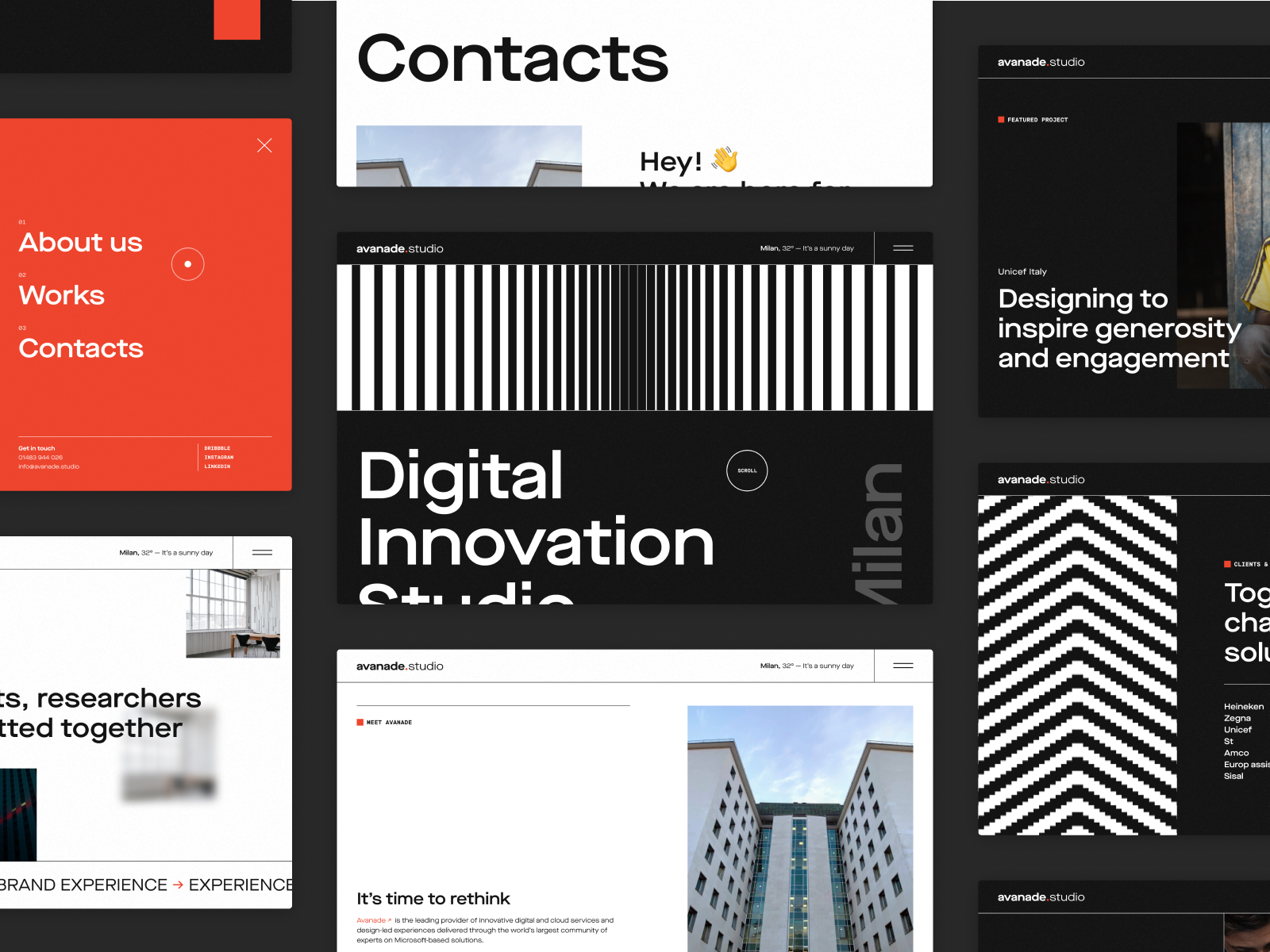
Dynamic black & white geometries to express the character of the studio
Dynamic black & white geometries to express the character of the studio
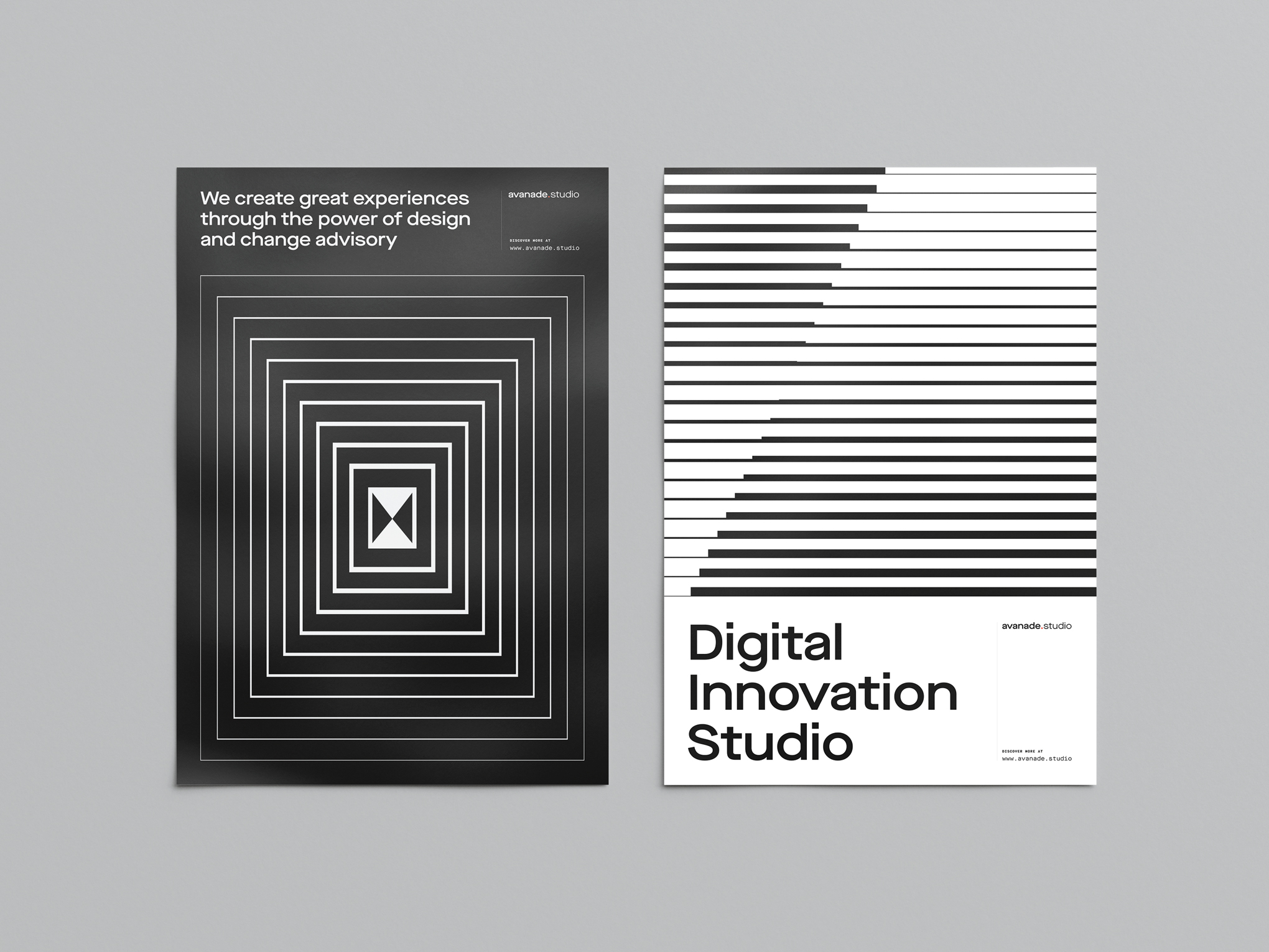
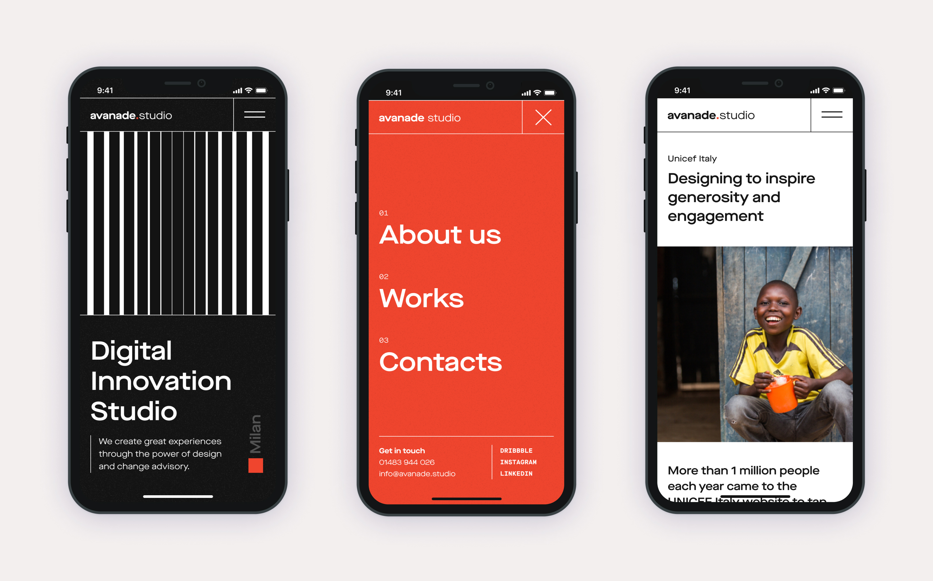
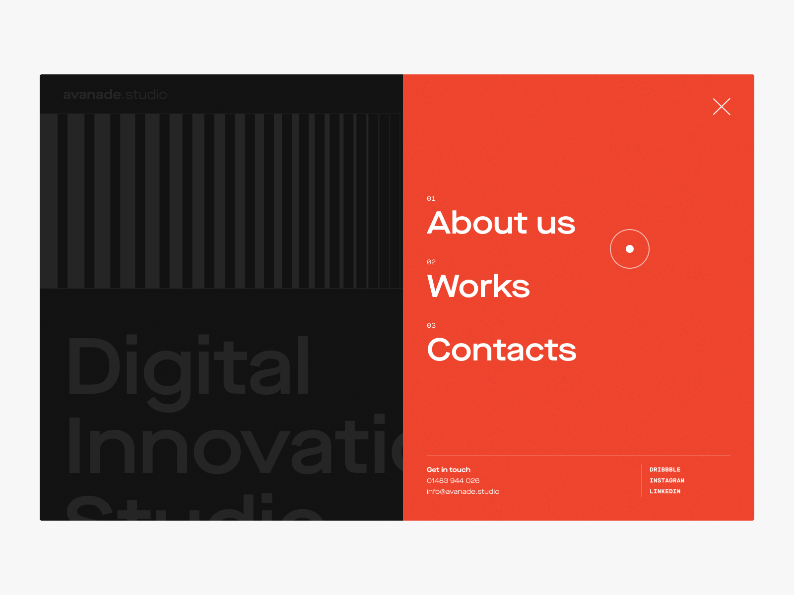
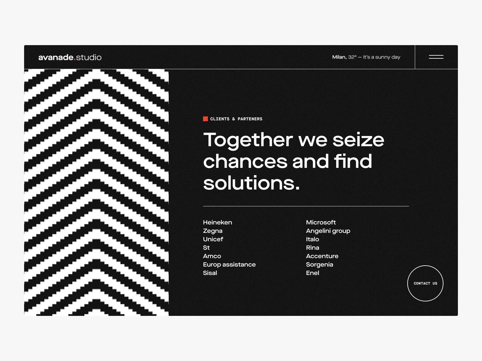
The patterns designed for the identity becomes animated and interactive in the website
© 2021 Marco Miccichè - All rights reserved
© 2021 - Marco Miccichè
All rights reserved